![]()
Review: 'Red Lantern: The Crimson Divine', by Rukis and AlectorFencer
 Today we look into the newest release from Rukis, Red Lantern: The Crimson Divine, a joint venture with AlectorFencer.
Volume 1 of a planned three-volume trilogy focuses on Amon and the circle of characters that surround him as he lives out his days on the chain of islands known as the Matta’atel Shanivaar (or String of Tears) as a professional male prostitute.
The work alludes to racial tensions between two warring nations and the conflicts that inevitably arise from such a situation. It is on sale at Sofawolf’s website for $29.95.
Rukis' third printed publication, released almost in tandem with her second, [Unconditional], is a big step up from Cruelty (her first publication), which – while a valiant first try into the world of printed media – had many flaws, keeping it from being a great start to what seems to be a continuing series. Red Lantern, on the other hand, comes out strong; a solid storyline with extraordinary visuals from both artists that pushes forward solid characters and pacing conducive to a great overall experience.
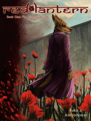
Cover art
First off, to speak of the cover; it is a vibrant piece of concept with a bold and tempered statement built into its core. It sets the tone the rest of the novel diligently follows, throwing in small points of action or poignant reflection connected by blossoming story and sub-plots, intriguing and smoothly keeping the pace moving. The cover would catch your eye in a store simply from the sheer amount of color draped across the front.
Deep reds and alluring purples dominate both the back and front, while only a few tones of stone gray and wood brown fill in the background spaces. A symbolic dual pose between two of the most central figures, Luther and Amon, makes great use of the all-black spine with a very painterly rendition of wind-swept petals from plants that are the key ingredient in a popular drug of the story; the Divine.
The one great flaw I have to speak of though is the left side of the back cover and this mess of blood splotches that runs down its side behind the synopsis. Disconnected from all the other elements, one can infer they are meant to link with the blood of Luther’s sword and on the boat’s deck, but what purpose they serve in doing so is beyond me. All it does is distract from the background, which is strong enough to stand unhindered from a rather stereotypical graphics trick. Close examination shows lines and cuts as if they were from a stock set of brushes. Beyond that bizarre and ultimately forgettable quirk, the cover stands quiet, not one to shout or entice with an action pose. It resonates perfectly with the theme of the volume; while there is action to unfold inside the book, the pages seem content to hold back the majority of what is to come, patiently building its energy with a paced story and several amazing moments of reflection.
Interior artwork
 As I’ve mentioned, the art of this book was a collaboration between two artists; Rukis, who handled the characters and action shots, and AlectorFencer, who primarily created the expansive backgrounds. Not to diminish Rukis’ art, but the backgrounds stand to be some of the best parts of this book, if for no other reason than they create a tangible warmth and cold with each piece, doing wonders to make each page that much more believable and enticing. I felt drawn into the world of Red Lantern purely by AlectorFencer’s skilled work on the cities, ships and coastal regions. The yellowy-gold lights that shine into the blue and still night of the Harkalla District, along with the loose detailing of the lit windows is a fine example of how each landscape and urbanscape has a feel of life and civilization built into it.
When I had a chance to interview Rukis, she stressed how much effort had gone into merging their two styles to prevent discrepancies between them. And it shows. Particular attention to the lighting across both artist’s work really helped to make the two one; there was definite effort put into creating a unified artistic theme. What could have been something the same of the cover art for Flood Water’s Rising – where foreground and background elements looked almost Photoshopped atop one another – instead became a brilliantly smooth synergy between the two artists' styles.
If you follow either artist and can recognize their styles, you’re going to be able to find points where their styles diverge without too much difficulty; but the fact that there were two different artists working on separate aspects of the graphics is never obvious and was hidden with skill, especially considering the few published works Rukis has put out. I doubt an average reader with no foreknowledge of the collaboration would pick up on the different styles, at least without a second read-through.
This is not to say that Rukis’ share of the work stands any the less important, characters without life, without appeal would not be saved by backgrounds alone. The costume details and their varieties all come off fluid, colorful and most of all unique. With a distinct Indian flair to much of the island’s inhabitants, Amon stands gracefully in any scene he inhabits, while the Amurescans and Carvecians indicate their respective lands through their postures and clothing. There is a fair amount of experimentation by Rukis when it concerns the action that was unexpected. It almost feels like she is reaching around for the particular techniques that work best for her as I saw several different forms used throughout the volume. I’m not really sure what to say on this, I didn’t hate any of the techniques used, but I would definitely like seeing one picked and focused on so that it could come on line with the rest of the work, which stays consistent throughout the volume.
The faces hold their emotions very well on the whole, though some look 'dopey' for lack of a better term; the deliverance of emotion still seems to be somewhat of a struggle for Rukis when it comes to certain facial features. Although rapidly improving, it stills feels like there are a handful of gestures and expressions she has yet to nail down as well. Yet when the emotions do work, they work surprisingly well; many panels and at least once a whole page is carried solely by the visuals and the emotions portrayed in them. What really surprised me is how effective this tactic was, giving a silence that speaks the thoughts and words of the scene through eye contact and body posture that written dialogue would only take away from. Much respect to the creators for this decision.
Writing
If it is true that the artwork can get wonky at times when it comes to emotions and their displays, the writing is more than able to step in and deliver solid dialogue that drives home the scene’s intent whenever this occurs. Conversations flow organically without walls of text, not force-feeding us paragraph after paragraph of exposition, which can happen very easily in an introductory book.
We don’t learn all that much of the Red Lantern world, at least not anything beyond the brothel and titbits in relation to select plot elements. The authors are content to give us information on the main characters, strong hints of a recurring antagonist and some background information of various subjects but it seems to never want to deviate from the story just to give us erroneous supporting information. It works very well in the first book to add an air of mystery and isolation to the Shanivaar islands, but this is something that could easily become a crutch if the authors never give us any, more detailed information concerning the world they’ve created at large. We only see roughly three distinct spots of the town they live in. Here’s hoping they know when to drop this tactic once it outlives its usefulness.
Some of the word bubbles seem poorly-placed and there were a few pages I had to give a glance over to figure out the panel numbering or direction; I’d inadvertently found myself reading panels out of order. This can and has stopped the pacing for me as I’ve flipped from one page to the next. It never gave me any deep burning frustration, but it needs to be ironed out before the following volumes come out. That said, it never became a deal-breaker when reading and I couldn’t get too worked up about it when the story overall makes up so much for any grievances.
Factors setting Red Lantern apart
The ending is the true blow, some excellent writing that I honestly was not expecting. The final pages don’t throw in a twist or climatic upheaval but rather hearken forward to a new chapter in the lives of the characters, mixing levels of success and sorrow, despair and a ray of hope for them as well for the brothel they live in. It exudes a quiet sense of powerful emotion that doesn’t extend its welcome, not needing to cheapen the climax with some sort of pithy ‘to be continued message’ or a blunt set of summary text to spell out its intention.
The setting’s intro is a sex scene, sad and without intimacy or any thrust upon attempts at romanticism. It is cold and reluctant by both parties involved and speaks volumes in so little time and almost no words. The amount of time given to the relationship between the trio of main characters feels to be the exact amount needed to give it plausibility and for the emotional connection between them to have the necessary substance for the bigger decisions that occurred in the later half to have a concrete sense of credibility. The main focus for the majority of the book, it is a tale of three people’s lives intertwined that quickly has you caring for their futures by the end, without manipulation or cheap shots to the heart strings. A large supporting cast flits in and out of the story, and was given an appreciative amount of substance that hopefully pans into some meaningful results.
Execution
By the end of the book we see the story having completed its first main story arc on a definitive and well-executed note, while leaving numerous plot points and sub-plot points needing to be resolved and with the grab needed that the reader is eager to read the next volume in hope of seeing these hinted-at events unfold. This is the one flaw I failed to mention in my Nordguard, Vol. 1 review; the second half had a very hurry-up-and-wait feel to its ending. It was a traditional set up and while the creators followed through strongly and with expertise for all the necessary factors of a good story, it felt lessened somewhat when the reader realized that the meat had been saved for the following volumes. While, most times that idea is inevitable when a trilogy is planned from the beginning Rukis did a fantastic job of hiding this realization behind a standalone story arc that drove all the surrounding elements forward; letting them continue onward as it came to a conclusion.
Conclusion
Red Lantern is a damn good book; with visuals, story and characters that all bring in superb performances and in tandem with each other; the themes of adapting to a new world, an uncertain future and its Indian culture aesthetics create a unique and memorable graphic novel.
The work is both a promising beginning to a trilogy and a standalone book that shines on its own merits, not requiring a second or third book for an individual message of harsh lesson to be told. It contains intrigue, connection to and for the characters, and a story that unravels itself at its own pace, placing each in measured turn – the pacing having enough key points of high-energy to keep events from stagnating without ever having to resort to filler or miscellaneous action. It talks about an uncomfortable truth with grace and maturity that will resonate with the reader well after the book has been put down.
I eagerly recommend this book to anyone who reads books for a strong and mature (warning; very mature) plot and felt that the fandom has been sorely missing something of that nature. The art will please the eyes and the story will please the mind. The flaws that are present cannot come close to destroying the great tale, woven by both the artists and the writing. It is, in my eyes, most definitely worth buying and reading.
About the author
Earl_Madness (Earl Z. Madness) — read stories — contact (login required)a photographer and Panther from maybe Poland, interested in photography, writing, video games and working on emotional output
To see more of me, head here; http://www.tumblr.com/blog/madnessmadebeautiful
Comments
I've read the free online version but I would appreciate seeing the entire work. As I read it page by page over a long period of time I can't remember too much about flow but I do recall being sometimes amazed by the beautiful backgrounds. $30 is a lot of money though, more than I can easily throw around, and the last time I tried to buy online it didn't work because I don't have a credit card. Maybe Sofawolf has some other payment method but if not I'm unlikely to even have the opportunity to get it.
"If all mankind minus one, were of one opinion, and only one person were of the contrary opinion, mankind would be no more justified in silencing that one person, than he, if he had the power, would be justified in silencing mankind."
~John Stuart Mill~
What's up with all the articles and awkward interviews on rukis.
Apparently people like to do stories on Rukis and her work. We have another interview in the queue, in fact.
And a cool article about cats...
-The impatient puppy paces back and forth-
"If all mankind minus one, were of one opinion, and only one person were of the contrary opinion, mankind would be no more justified in silencing that one person, than he, if he had the power, would be justified in silencing mankind."
~John Stuart Mill~
I'm not sure if you bought Alector's book of the backgrounds she provided for Red Lantern, but I personally noticed some discrepancies in terms of lighting. Alector used this wonderful style of lights, sticking mostly with a reddish pallet.
Rukis didn't do a very good job with lighting. An example I saw was strongest in the pages where Amon provides his services for Luther. The room is small, almost like a broom cupboard. In that scene, the door is closed, what looks like a window is closed, and the only source of lighting is the lamp on one wall above them. However, the characters look like they are illuminated by candles covering the entire room. Rukis' use of lights without sources comes up quite a few times throughout the book.
Another thing I'm not sure if you caught on to, or even really cared for it, but the scene right before this servicing, we're treated to a very lengthy bit of exposition. To me, it just seemed be awkward pacing to go from long exposition to oral sex.
Everything else, I agree with 100%
Post new comment